


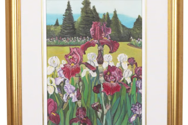
Every color in a painting has both value and tone, says Canadian artist Patti Dyment. Tone is the degree of intensity or strength of a color. A pure lemon yellow has a high tone, while browns have low tones. Value describes the relative lightness and darkness of colors in a composition. White is the highest value and pure black the lowest. Artists use a range of values to create an illusion of the natural world.
Tone
Tone is the intensity, or saturation, of a color. Tone varies with the quality of the paint, Dyment says. Adding filler to paints decreases the percentage of pure pigment. Modern paints use pigments of high density. Artists mix intense colors to make them natural by diluting their purity. When you add white, black or other colors, you change a color’s tone by decreasing its intensity.
Value
Value is the degree of light and dark of each color in a composition. Dyment says paintings are most interesting when they create strong patterns of light and dark. The darkest colors in a composition come forward and the lightest recede because humans perceive elements in a landscape as softer and lighter the further away they are. It is important in a realistic painting to make the values of each element correct in relation to all the other elements: for example, a tree in the foreground is darker than a mountain, and the mountain darker than the sky.
Painting
The key to good painting is getting the tone and values correct, whether you use oil, watercolor, pastel or acrylics. Blending paints to make them darker or lighter is more than just adding white or black, says Dyment. A painter considers the relative value of each element in the composition as well as the relative intensity of each color. Dyment quotes Cezanne as saying all the colors of nature are already deintensified. “A common mistake is to use colors in too high of intensity,” she says. Reduce intensity by adding a color’s complementary color or using brown or gray. Artists use the rules of complementary colors, tone and value to create landscapes and portraits that look realistic and abstract works that take on a life of their own.
Sketching
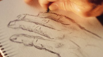
Values are especially effective in sketching with pencil, ink or charcoal. Lights and darks create the effect of three-dimensional objects, making some elements recede into shadow and others emerge in the foreground. The play of tone is somewhat less in sketching, but the intensity and uniformity of the strokes adds to the texture and shape of the figures. Charcoal comes in colors of black and rust reds, so tones are a part of sketching in charcoal and in colored pencils, which add tone to sketches.